How to get the data in
Visualizational aspects
| Index | ||
|---|---|---|
| Image Processing II How to get the data in |
A-Z | Image Processing IV Visualizational aspects |
Now that we have the 4 spectral bands (see preceding chapter) as 4 separate IDRISI images, we should know more about their properties: they were derived from full sample RESURS-O1 satellite data. The satellite's MSU-SK sensor scans over 5 spectral ranges. 4 of them are included here (the 5th is a thermal band with lower spatial resolution; comparable to band 6 of Landsat TM 5 data):
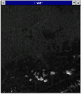
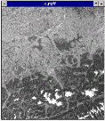
All of them have a spatial resolution of 160 m. That means, one pixel represents the mean spectral reflectance value for an area of 25600 mý. The windows show a subset from the imported sample data created with the WINDOW-utility. A little bit below the images center lies the town of Salzburg Remotely sensed multispectral data show a portait of earth's surface expressed as spectral reflectance values. So the appearance of different landcover types depends on their spectral properties - e.g., an object absorbing most of the incident radiation will show up as dark to black. Differentiation of objects is based upon the fact of different absorption resp. reflectance properties of objects within the various spectral bands measured by the satellites scanner. |
|
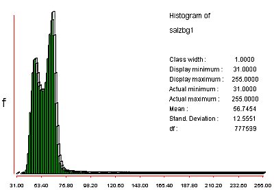
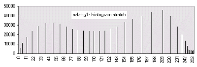
It is now common practice to achieve a visual impression of the data before going deeper. Look at the upper row (band 1 & 2) in the figure above. There's not much contrast and the HISTOgrams clearly show why:
|
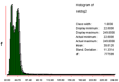
Note the very strong positive skewness in the distribution of the digital numbers. The 'rat-tail' of values between ca. 80 and 255 belongs to the highly reflecting ice and snow regions in the southern part of the image. For the color display of byte images (such as this ones) IDRISI matches the cell values with their corresponding color codes (also see the chapter on palettes). In our example most values concentrate in the range 31 - ca. 80. |
|
The technique of contrast STRETCHing allows us to gain some more contrasted visual representations. In general we force to rearrange the distribution of the values in our image. |
|
The following table demonstrates the effects of the different contrast stretching methods available in IDRISI. Even the small pics should show the differences:
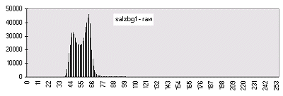 |  | This is the same histogram as in the first histogram figure above, only aspect ratio and scaling are slightly different. The low frequent numbers greater than 80 are not visible in this diagram. |
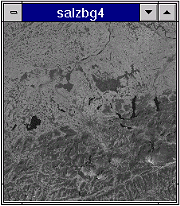
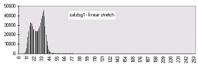 |  | The linear stretching takes the actual minimum/maximum of 31/255 and rescales them to numbers between 0 and 255. In our case this has the opposite effect of what's desired - the image even gets darker! If I'd taken the third option for stretching in IDRISI - linear with saturation points - the results would have been quite fine. |
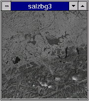
 | 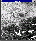 | An improvement on the linear is the histogram-equalization approach - more display codes are assigned to more frequently occuring digital numbers. Notice the dramatically improved contrast! |
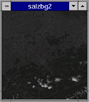
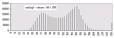 |  | If we are mainly interested in enhancing the darker part of the image only, we may choose a new number to be our maximum value. For this example I told IDRISI 80 to be the new maximum for rescaling. Lower values have undergone a linear stretch. All raw data values greater than 80 were forced to become 255 in the output. We cut off them. |
We already went through FILTERing in more detail, so check back there, if you are not familiar with that kind of methods. They may be useful to enhance certain details, e.g., directional surface features.
| Index | ||
|---|---|---|
| Image Processing II How to get the data in |
A-Z | Image Processing IV Visualizational aspects |